In this tutorial I’ll be using Adobe Photoshop 2021 (on a PC) to show you how to take a photograph and apply various techniques to it, to turn it into a stylized version of itself. The goal is to mimic the look of an illustration and to produce a flatter, less detailed rendering of the lines, contours and colors of the original photo.
Check out the fantastic deals that Adobe offers here. There are many different affordable plans available so you can get started editing photos, creating illustrations, or designing whatever your imagination can come up with!
Here we go – let’s turn a photo into an illustration!
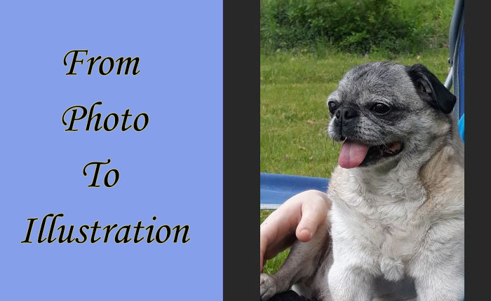
Because I was going to be looking at my chosen image for quite some time while working on this article, I wanted to choose a cute image that I wouldn’t get tired of too quickly. So I used a snapshot I took of my little Pug dog Mia (she’s such a good model).
Please note: some of the steps I took with my Pug photo might not be necessary with your particular photo; for example, your photo might not need to be lightened or brightened up first.
Firstly I fired up Photoshop and opened my chosen photo: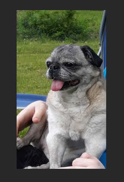
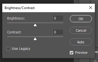
It must have been cloudy that day so I felt the need to brighten it up. Plus I increased the contrast a little. You can do this by going up to your PS top menu and clicking on Image > Adjustments > Brightness/Contrast. This little window should appear, where you can move the sliders to the left or right as needed.
At this point I decided to crop out most of the lower part of the photo and just do a headshot – to keep things simple.
Then I used the Clone Stamp Tool  to remove the extra details in the background and turn those blue areas of the lawn chair (over to the right of Mia) into green grass. The Clone Stamp tool can usually be found among your tools menu along the left side of your PS screen, unless you had previously dragged that menu elsewhere. This tool is a very efficient way to copy pixels from one area of a photo and deposit them into a different area.
This is the cleaned-up version of my photo to use as a starting point for the illustration: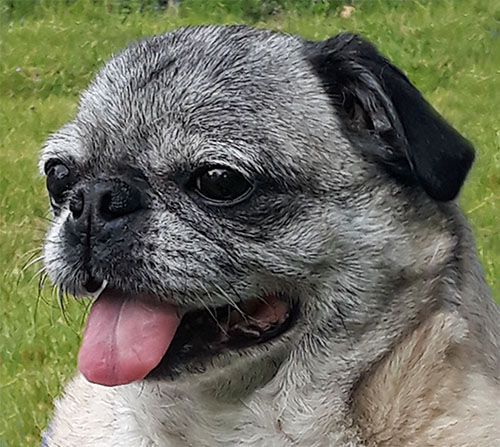
I do need to pause for a second to say I LOVE THE CLONE STAMP TOOL and it’s my new best friend. Only recently did I discover this wonderful technique/tool and it’s so cool what can be done with it! Prior to discovering the Clone Stamp what I’d do in a case like this is to select a portion of an image (like a patch of grass), copy it and then paste it as a new layer over the stuff I wanted to cover up (like the bit of blue lawn chair). Then I would usually use the Smudge tool to soften and blend the edges together.
If you’d like to learn more about the Clone Stamp tool, here are some excellent instructions from Adobe Support.
OK – moving on! Next what I did was go into Adjustments in the right-hand menu and click on “Create a new Exposure adjustment layer“:
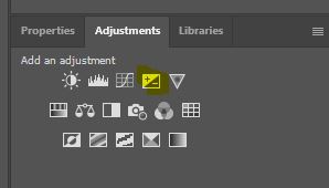 and adjusted the settings via this window:
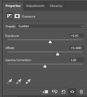
I modified the exposure layer to create a sort-of haze over the whole photo (per the settings on the little screenshot above). This softens up the pixels a bit so the end result will be less sharp and detailed.
The next step was to make sure the layer with my photo was selected by clicking on it in the right-hand Layers menu. Then (nestled up in the main menu at the top of my Photoshop screen) I clicked on Filter and chose Filter Gallery from the flyout menu. After clicking on the tiny arrow to expand the Artistic section, I chose the Poster Edges filter and applied the following settings:
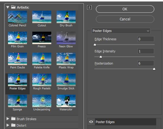
I set the edge thickness to the minimum of 0, the edge intensity to only 1, but ramped up the posterization effect all the way up to 6.
To “poster” edges basically means you’re aiming to simplify a photo by reducing the number of colors and fine, sharp details in the photo, while defining the edges with thick dark lines.
Here’s what Mia looks like at this stage:
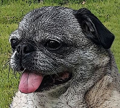
We’re getting some texture onto the picture so it’s less realistic now… but not quite there (Mia just looks like she rolled in the mud).
At this point – still up there in the Filter Gallery – I chose the Cutout filter: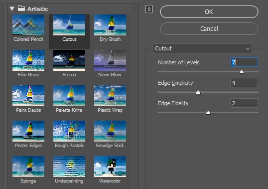
I set the number of levels to 7, the edge simplicity to a middle-of-the-road 4, and set the edge fidelity to 2.
What the cutout filter does is, it takes a photo and makes it appear as if it’s crafted out of bits of colored paper. This goes a long way towards achieving the hoped-for appearance of an illustration.
Here’s what Mia looks like at this stage:
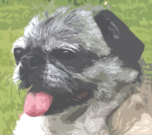
Now we’re gettin’ somewhere! My little Pug photograph is starting to look a bit like an Impressionist painting.
But let’s push it one step further and see if the photo can appear a bit more ‘cartoon-y’.
In an effort to cartoon-ify my image, I decided to hit the photo one last time with yet another Poster Edges effect (same settings as earlier). This is the result:
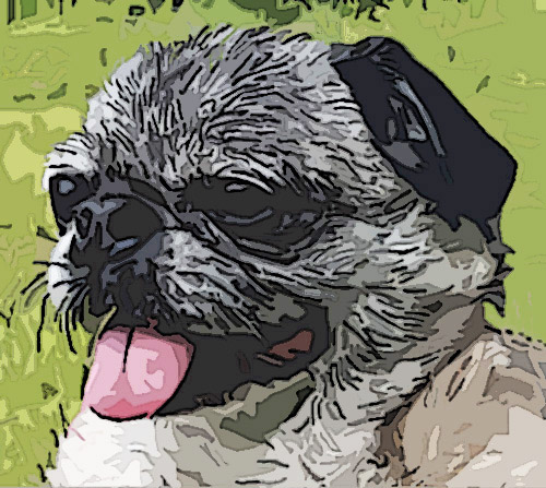
Adding texture to the photo for a different effect
Later, to try a different effect, I removed the lightened effect of the exposure layer, then went into Filter > Filter Gallery again, and clicked on “Texture” then on the option for “Texturizer”:
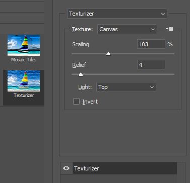
This filter comes with a few different options for the type of texture you can apply, such as Sandstone, Burlap and Brick. I chose Canvas with a Scaling value of 103%, a Relief value of 4 and the Light set to “Top”.
Here’s what Mia looks like with some texture added:
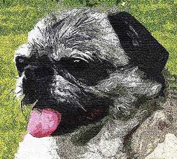
Lastly, adjust any other settings as needed, such as your photo’s brightness, contrast, hue/saturation, levels, etc. and save it. It’s best to save it using a different filename as your original photo so you don’t overwrite the original.
There are so many cool effects you can apply to your photos, icons and images using Adobe Photoshop! Check out these other articles for more Photoshop techniques and tutorials:
- Create a Text Layer Clipping Mask in Photoshop
- Easy Ways To Outline Text Using Photoshop
- How to Create a Poster Using Photoshop
Have fun tapping into your creativity! And please drop a comment below and share this article if you liked it. Thank you. : )
