If you are familiar with the basics of how to set up bulleted lists in HTML, and as you become comfortable with it, you might find yourself wanting to experiment a bit now and then. If you are not familiar with how to set up lists in HTML, check out our previous article on setting up unordered lists, ordered lists and definition lists.
One of the cool things about the HTML coding language is how versatile it is and how creative you can get with it. In my experience that creativity usually comes in the form of adding some CSS to the HTML, to jazz things up.
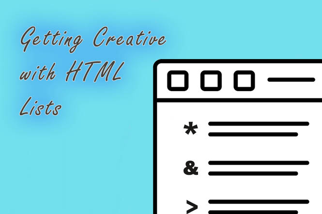
How to Get Creative with HTML Lists
As outlined in our unordered lists, ordered lists and definition lists article, first you’ll need to create the outer container that will house the items that you want to list out. This is done by first determining what type of list you’d like to build.
To begin with a simple unordered bulleted list, start by using “ul” html tags (the “ul” stands for “unordered list”), like this:
<ul>
</ul>
Then add a few items that you would like to list out inside of the opening “ul” and closing “ul” tags. This is usually done by using “li” — the “list item” html tags — like this:
<ul>
<li>First item</li>
<li>Second item</li>
</ul>
This should result in the usual solid round bullets appearing in front of your list items. These are what are essentially disc-shaped bullets when referenced via CSS.
Circle and Square-shaped Bullets
To get a tiny bit creative we can use a different bullet by specifying what the style that bullet should be, using CSS code. Let’s change the usual solid round bullet to an empty circle by using the following inline CSS code:
<ul>

<li style="list-style-type: circle;>First item</li>

<li style="list-style-type: circle;>Second item</li>

<li style="list-style-type: circle;>Third item</li>

</ul>
Here is how that CIRCLE code would render in the browser output:
- First item
- Second item
- Third item
<link rel=’stylesheet’ id=’add-id-here’ href=’call your external file here’ type=’text/css’ media=’all’ />
This is how to change normal bullets to a square shape using some inline CSS:
<ul>

<li style="list-style-type: square;>First item</li>

<li style="list-style-type: square;>Second item</li>

<li style="list-style-type: square;>Third item</li>

</ul>
Here is how that SQUARE code would render in the browser output:
- First item
- Second item
- Third item
Create Your Own Bullet Shapes
There is no need to stick to only using the usual round or square bullet symbols. If you want to get a little crazy with it, try looking no further than your keyboard.
Using Keyboard Symbols as HTML Bullets
We chose a few keyboard characters at random to use for the following examples.
The CSS:
#asterisk {

list-style-type: "* ";

}

#dollar {

list-style-type: "$ ";

}

#percent {

list-style-type: "% ";

}

#arrow {

list-style-type: "> ";

}
The CSS added to HTML:
<ol>

<li id="asterisk">First item</li>

<li id="dollar">Second item</li>

<li id="percent">Third item</li>

<li id="arrow">Fourth item</li>

</ol>
And here is how that html list code should appear in the browser:
- First item
- Second item
- Third item
- Fourth item
Note: it is optional whether to include the space after the symbol within the CSS. If you don’t want any space, simply remove it from before the second set of quotes, as in the following example:
#asterisk {

list-style-type: "*";

}
Adding Color to HTML List Text
Adding a bit of background color surrounding your list item text is pretty easy and can be accomplished by adjusting the CSS like this:
#pink-background {

background: pink;

height: 18px;

width: 80px;

padding: 8px;

}
And here is how that should appear in the browser, when applied to the first list item:
- First item
- Second item
- Third item
- Fourth item
Adding Color to HTML List Bullet Points
Sometimes you might like to add color to the bullet point itself. In this case you could try some CSS similar to the following code — which involves added the “:before” pseudo element to the li or list item html element:
ul {

  list-style: none;

}

li:before {

  content: "* ";

  color: purple;

}
This is how the purple asterisks and html list would appear in the browser:
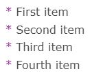
Pretty cool, right? You could also try experimenting with it to add other styles to the list, such as adding a margin, padding, different types of li content, etc.
These ideas and techniques are just the tip of the iceberg in terms of what can be done to HTML lists to spice them up. We hope you enjoyed this article. Please share it, and thank you for reading! 🙂