Some corporate logo redesigns worked out better than others. Many revamped logos have turned out to be an improvement upon the original design and served to increase their brand’s message and recognition factor. However, there are a few redesign efforts that arguably should never have taken place. As with much in the art and design world, there is room for personal taste in deciding whether or not these company logos were better before or are better now, after a logo and brand design overhaul.
A key consideration is to ask the question “does the new logo still evoke a mental image of what the brand stands for?” If a redesigned logo strays too far from a businesses’ already known (and hopefully loved) image, then it should probably have been left as-is. Company logos and brands, if well-established and trusted, can often feel like old and familiar friends. When those “friends” suddenly undergo a dramatic change, it can be confusing and unsettling.
In the article below we give you the Code Dragon point of view and opinion in terms of which logo design is more successful: original VS current design. And in some cases we will also look at a past (interim) iteration of a logo. Please read on for our take on a few of the more notable corporate logo redesigns – then decide for yourself whether the end result was successful, or if things should have been left as they originally were!
Pepsi
The drink we know as Pepsi Cola was first concocted in 1898 by pharmacist Caleb D. Bradham. As was done with many of the logos from the the late 1800s to the early 1900s, its logo was drawn by hand by a non-designer; in this case by Caleb Bradham himself. The original Pepsi logo has an ornate, swirly style that is very characteristic of the graphic design from that time period. This logo – like many of the oldest ones do – breaks an important rule for logo design.
It is overly complicated and is difficult to read if shrunk down to a very small size. Even at a large size it isn’t super easy to make out the distinct letters.
Original Logo: 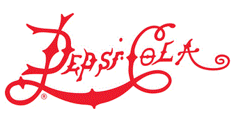
The wordmark logo was given the addition of a circular bottle cap design with ridged edges during the 1950s, and the color blue was added. That design morphed over the course of the ’50s and ’60s; the word “Cola” was removed, the swirly font was replaced with a chunky, bold sans-serif one, and the overall look was simplified. The logo was then simplified even more and flattened in 1973, and an additional shade of blue was added.
Interim Logo: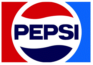
During the 1990s the Pepsi name was separated out from the circular figure and was italicized. Later in that decade and into the mid-2000s the logo was given the 3D treatment. It appeared with lots of colors, shiny shades and gradients — and at one point it even had water droplets added. Thankfully that excess of detail slowly evolved in a much more clean, simple circular figure which is termed “the globe.” That concise flat design, along with a totally new lowercase font is what the company is using today.
Current Logo: 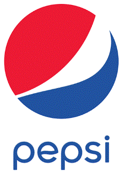
Verdict: the clear winner here is the interim logo. The version that was created in 1973 will always symbolize Pepsi to me more than any other, because I grew up with it, and I think it remains the best and most iconic version. That being said, the current version is an obvious improvement upon the original.
Monster.com
First started in 1999, Monster.com was one of the pioneers within the job board and online recruiting industry, and soon became the leading job search site in the early 2000s.
The Monster logo started out with a bold purple color and uniquely stylized lowercase typeface. It has a bit of personality and is simple enough to be easily recognizable and understandable, while remaining highly readable when scaled down. The wordmark font was also special enough to distinguish it and set it apart from other logo font faces.
Original Logo:
Fast-forward to today: for some reason the original design was re-imagined into the form of… a waving flag. This new flag creation came complete with ripples in the purple “fabric” and a new uppercase font. As I understand it, the flag is intended to represent how Monster is helping job seekers to find better careers (or better lives… or both?) by planting their own personal flags into the virtual “ground” – and taking more control over their job search and subsequent future. That message could be missed if not for the supporting tagline below it of “FIND BETTER.”
Current Logo: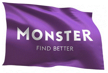
The latest Monster.com logo comes in an animated version as well as in the usual static format.
Verdict: the original logo is simple and effective and seemed to work well. The new logotype just seems less distinctive, and frankly, the overall effect is a bit confusing when the background flag design is taken into consideration. At least that gorgeous purple color is still there! Overall, this redesign might be a case of someone overthinking the situation, but points should be awarded for them trying something different.
Mountain Dew
The Mountain Dew brand and soda has been around longer than I realized – since the 1930s apparently. It all began with two brothers from Georgia by the names of Barney and Ally Harman, who moved to Knoxville, Tennessee. One day they started experimenting with different sweet combinations that they could mix with booze (whiskey most likely). They called their creation “mountain dew” because of its alternate meaning (aka “moonshine”). Eventually the booze was removed, the rights were sold to PepsiCo – and the rest is history.
And man, I have to say that I drank WAY too much of this mega-sweet, super-caffeinated stuff as a teenager…
I think the original logo is quite adorable, really. It’s whimsical and humorous and old-timey. Of course it probably won’t work well in very small sizes and is too complex for a logo (if you take into account the illustration and slogan).
Original Logo: 
Here is an interim version of the logo that (in one variation or another) was used from 1969 until 1996:
Interim Logo: 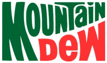
This is a massive departure from the original design and the above logo is the version I grew up with. Can’t say as I was ever crazy about it… but at least it was bold and colorful.
Then later, in 2009, for some odd reason the company removed the word “mountain” from its logo and replaced it with “mtn”. Also, the logomark was tilted on an extreme angle. This is the current incarnation in all its modern “edgy” glory:
Current Logo: 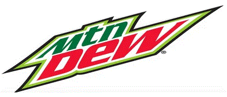
Verdict: the original logo probably isn’t practical in today’s modern techy world, I get it. But the new logo is just… why?? I think this one is a tie between one of the interim logos and the present-day one and there isn’t a clear-cut winner here. I really like Mountain Dew as a product, but the logo, colors, brand style, etc. have never been a true stand-out for me.
Federal Express (FedEx)
Speaking of brands that had their beginnings in the great state of Tennessee (see Mountain Dew, above): Federal Express had its origin in Memphis, Tennessee in 1973. The original logo was implemented in 1974 and had a great run for two decades until it was redesigned during the ’90s. Notably, FedEx has only employed the use of two different logo designs, as opposed to most major brands that seem to change their logo every decade or so. Although it could perhaps have been a bit more legible in its letter form and spacing, especially at smaller sizes, the original logo was bright and distinctive.
Original Logo: 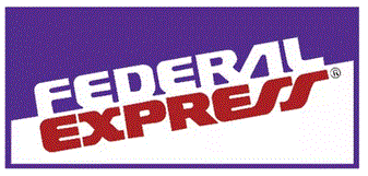
In 1994 the company adopted the shorter brand term of “FedEx.” Consequently, they came up with a cleaner, bolder and more clever logo wordmark to adapt to this new, snappier corporate identity. In the year 2000 the name of the company was also revamped into FedEx Corp. and Federal Express became FedEx Express. The blue shade morphed into a deep purple, orange was added, and the logo that we still see today was born.
Current Logo: 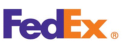
Verdict: hands-down the winner is the “new” logo. It is a brilliant example of how to use white space and negative space to create an effective, vibrant, compact design. And that hidden arrow only reinforces the message of speed and efficiency.
Black & Decker
This entry on our list was founded in 1910 with the name “The Black & Decker Manufacturing Company” by S. Duncan Black and Alonzo G. Decker. The company had its beginnings in Maryland and was originally a small machine shop. The first Black & Decker logo from 1910 strikes me as being actually fairly modern at first glance. It was made up of chunky bold uppercase lettering and a stylized “&” symbol.
Original Logo: 
Here is an interim version of the logo that was created in 1984 and was in use until the latest redesign back in 2014:
Interim Logo: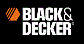
This iteration keeps the bold uppercase lettering and black color from the original design, while incorporating a nice orange hue to the hexagonal shape that was introduced in 1912. I personally love this version and think of this specific logo when Black and Decker comes to mind.
During the 2014 redesign it was determined that the hexagonal bolt symbol must be done away with, as the brand was moving away from being associated with only power tools. In addition to drills and chain saws, some of its most popular items include household items – vacuum cleaners and coffee makers and the like. Ok – fair enough. But for some inexplicable reason they removed the ampersand symbol and replaced it with a plus symbol… so now it reads more like “Black Plus Decker.” I’m sure that was intentional, but for many folks the change was confusing. At least the designers kept the 1984 color palette; except for the use of white, that is.
Current Logo: 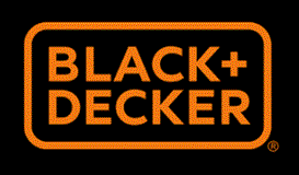
Verdict: this is your classic case of “if it ain’t broke don’t fix it.” The older interim logo resonated and amplified the company’s established image of strength and durability. But why can’t vacuum cleaners and other household appliances also be viewed as powerful and durable?
The strong slab font, bold colors and iconic hexagon symbol perfectly reflected what the Black and Decker brand was all about. I understand that they’re trying to move away from the power tool, industrial-type of image and move towards a broader, more enveloping image… but the new logo is a bit of a yawn. Plus, the swap out of the ampersand in favor of the plus symbol seems like a step backwards.
Apple
Last but certainly not least on our list is Apple Inc. This remarkable company was started in 1976 by Steve Wozniak, Steve Jobs, and their buddy Ronald Wayne. The earliest days of Apple were spent in Steve Jobs’ garage, where the founders would come up with all sorts of clever gadgets – including the first “computer” that looked a bit like a typewriter hooked up to a TV screen.
The actual, original logo for the Apple Computer company was created by co-founder Ronald Wayne, and depicts Isaac Newton just as he was about to “discover” the laws of gravity after being hit on the head by an apple. The scene works well as an illustration or drawing, but as a logo is not a great choice; it is overly detailed and complex.
Original Logo: 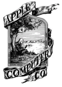
Soon after its initial creation, Steve Jobs started looking to redesign the logo, as he (rightfully) viewed the original logo as being old-fashioned and not easily reproduceable in smaller sizes. Here is the next version of the logo that was created in 1977 by graphic designer Rob Janoff, and was in use until the latest redesign in 1998.
Interim Logo: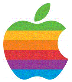
This iteration is a massive improvement, due to the simplicity and sleekness of its design. The main goal of logo design is to make it easy for the human brain to understand and remember a brand by that one symbol alone, so it isn’t wise to try to force the consumer to have to recall or process too many details at once. A great logo is stripped down to only the bare essential lines and shapes (ex: the Nike swoosh). This design accomplishes this feat magically, as the company name doesn’t even appear within the logo design, yet we all recognize the brand.
The rainbow colors, while very befitting of the bold and colorful time period of the 1970s and 80s, added a little bit of unnecessary complexity to the near-perfect apple shape. These colors were removed during the redesign of 1998. The more simple, monochromatic version of the Apple logo has undergone many different subtle changes and iterations through the years, but the basic clean and simple shape has remained intact.
Current Logo: 
Verdict: the latest (current) version is the best; as in, it is the most simple, pure, elegant and versatile form of itself. It is instantly recognizable and iconic, and very well done.
So there you have it! This was a rundown of just a few of the notable logo transformations that have taken place through the years. What do you think? Do you have a favorite?
Thank you so much for reading! When you have a moment, please share this article — and check out our related article on The Best Logos Ever Created. That compilation includes several very well-known brands and others that you may not have heard of yet. 🙂
