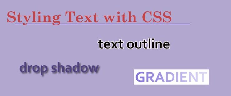
Using CSS to Style Text
There is SO much you can do to dress up your blog articles, enhance your websites, draw attention to your article headings – and much more – by adding a bit of CSS code to them. Below we created a table of effects that go a little beyond the basics, along with the code we used to create each effect.
If you are looking for more basic effects that you can create, we wrote an article on that subject (if you need to brush up on the more fundamental CSS text-styling techniques).
Note: I didn’t include the entire syntax for CSS declarations in the table below. For ALL of the below CSS styles, the code needs to be inserted inside the proper brackets, like this for one example:
.dropShadow {

  text-shadow: 6px 4px 8px black;

}
And you also need to reference the CSS id or class from somewhere within the HTML of your web page, like so:
<span class="dropShadow">Here's a little text with a nice soft drop shadow</span>
You can choose to declare your CSS right inside your page, or you can (and should) bring your CSS into your web page and website by linking to an external CSS file (a .css file).
Check out this article for further reading on the subject of how to reference/include CSS in your website or blog.
And now for some cool effects that you can try experimenting with:
| USE THIS CSS CODE | TO GET THIS EFFECT |
|---|---|
| text-shadow: 6px 4px 8px black; | Here’s a little text with a nice soft drop shadow |
|
Try experimenting with the different values – such as changing the h-shadow, v-shadow, blur-radius, and color. (h-shadow = horizontal shadow and v-shadow = vertical shadow) |
|
| color: navy; text-shadow: -6px 4px 8px #000000; | this text has a drop shadow going in the opposite direction |
| color: blue; text-shadow: 6px 6px 8px #000000, -5px -6px 8px teal, 10px 6px 8px gold; font-size: 22px; |
Here’s a little text with multiple drop shadows combined |
|
Again, try experimenting with the different values – such as changing the h-shadow, v-shadow, blur-radius, color – and try combining different types of shadows together! |
|
| -webkit-text-stroke: 2px teal; color: white; font-size: 21px; |
this text has a stroke outlining the individual letters |
| To learn how to outline text using Adobe Photoshop, here is a short tutorial on that subject. | |
| -webkit-text-stroke: 2px steelblue; color: black; font-size: 26px; |
more text with a stroke outlining the individual letters |
| This CSS effect will only work if you stick the prefix “-webkit-” in front of the CSS style declaration. | |
|
font-size: 36px; background-color: steelblue; /* this is in case the browser doesn’t support CSS gradients */ background-image: linear-gradient(12deg, teal, purple, white); background-size: 100%; background-repeat: repeat; -webkit-background-clip: text; -webkit-text-fill-color: transparent; -moz-background-clip: text; -moz-text-fill-color: transparent; |
this text has a CSS GRADIENT |
| This CSS effect will only work if you stick the prefix “-webkit-” in front of the CSS style declaration. | |
|
background-color: steelblue; /* this is in case the browser doesn’t support CSS gradients */ background-image: linear-gradient(82deg, navy, teal, white); background-size: 10%; background-repeat: repeat; -webkit-background-clip: text; -webkit-text-fill-color: transparent; -moz-background-clip: text; -moz-text-fill-color: transparent; |
this text also has a CSS GRADIENT |
| This CSS effect will only work if you stick the prefix “-webkit-” in front of the CSS style declaration. | |
Once you have a solid understanding of the fundamentals of working with CSS and HTML, there’s no limit to what you can do with it! Keep experimenting and using your imagination to see what you can do with text using CSS – and please let me know in the comments what you came up with. : )


