Not too long ago I created a website for one of my clients and decided to use the Squarespace web CMS/platform. The website was built using the Mojave template, which is part of the overall Brine family of Squarespace templates. There’s a lot you can do using this CMS (content management system), and it is very user-friendly and versatile.
Squarespace is heavily geared towards setting up websites in a visual manner and makes it easy for non-coders to add elements to their pages such as images, collages, galleries, text boxes, buttons, forms and so on. For me, one of the drawbacks to using such a visual website-building system is that it comes with the trade-off of not having as much control over those page elements as I would like (being someone who loves to play around with code). In my experience with this CMS, it is quick and easy to change the style in one place and have that change affect the rest of my site. But what if I want to add a special effect or a different color to an element on a single page? That is a different story…
Take the button element for example.
I can see how this would be a good thing in terms of making it easy to cascade changes across an entire website. However, as a web designer and coder, sometimes I would like to have the ability to change the styles of individual buttons independently of each other – the option to add a custom button anywhere I would like. It is well-intended by Squarespace, but it would be wonderful to have the ability to choose whether to style buttons globally or individually.
FYI, this is what Squarespace Support has to say on the subject of styling buttons: https://support.squarespace.com/hc/en-us/articles/206544727-Styling-buttons
“To help you create a consistent look, style changes you make to buttons affect most buttons on your site.”
Ok. First let’s explore how to change the style of a button using the core built-in functionality that comes with Squarespace:
Log into your Squarespace account and hover over the website you’d like to style, and click “EDIT SITE”. You should see a main menu that looks like this:
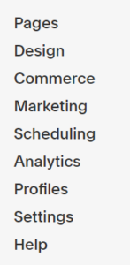
Click on “Design” in that menu and then click on “Site Styles.”
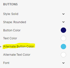
In the Design > Site Styles menu scroll down until you come to the sections for BUTTONS. There you should see several different options for changing various aspects of your website’s or blog’s buttons, including:
- Changing the overall button style to either solid, outlined or raised
- Choosing a square, rounded or pill shape
- Determining the button’s background color when it is at rest and in its hover (moused-over) state
- Determining the button’s text color when it is at rest and in its hover (moused-over) state
- Choosing a font face, style and weight for the text of your button
- Choosing a letter-spacing value and text-transform style/value
Since this article is talking specifically about what happens when someone hovers on a button element, here’s how to do that.
In the BUTTONS area of your Site Styles menu, click anywhere along the row for “Alternate Button Color” (either click on the text “Alternate Button Color” or click on the colored circle). That will open a window where you can choose a different color for the hover state.
In terms of options for adding a mouseover – or hover – effect, the only options available to me appear to be for changing the alternate button color and alternate text color:
Now, what if you’d like to take it a step further and do something on hover other than change the button and/or text color?
This is where knowing a little CSS code comes in handy!
Adding some custom effects to buttons in Squarespace
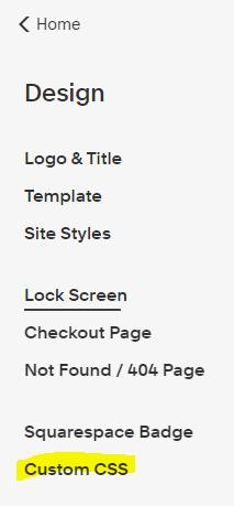
To start with I navigated to “Custom CSS”, which is the area in Squarespace where the user can add their own CSS code:
Then I popped back to my page in the browser, did a right-click and chose “View page source” to take a look at the source code. In my case I was dealing with a large button. For large buttons I singled out and targeted this style:
sqs-block-button-element—large
That is the bit of CSS code to concentrate on in terms of adding some cool button effects to large buttons.
If your buttons are small or medium, simply swap out “large” for “small” or “medium”:
sqs-block-button-element—small or sqs-block-button-element—medium
Here are a few special hover effects I was playing around with:
(move your mouse over or touch the buttons below to view the hover effect)
Effect #1 – Expanding text:
Effect #2 – Double border:
Effect #3 – Animated shrinking button:
Effect #4 – Moving shadow w/click effect:
Effect #5 – Lovely gradient:
Code for Effect #1:
.sqs-block-button-element--large {

  border-radius: 17px;

  padding: 15px;

}

.sqs-block-button-element--large:hover {

  background-color: #0E0B65;

  color: white;

  letter-spacing: 7px;

  text-decoration-line: underline;

  text-decoration-style: wavy;

  border-radius: 17px;

}
Code for Effect #2:
.sqs-block-button-element--large {

  border-radius: 8px;

  padding: 15px;

}

.sqs-block-button-element--large:hover {

  background-color: gray;

  color: black;

  border: 6px double yellow;

  border-radius: 15px;

}
Code for Effect #3:
.sqs-block-button-element--large {

  background-color: purple;

  color: goldenrod;

  width: 200px;

  transition: width 2s;

}

.sqs-block-button-element--large:hover {

  color: white;

  border-radius: 50px;

  letter-spacing: .5px;

  width: 130px;

  font-size: 13px;

  transition-timing-function: ease-in-out;

}
Code for Effect #4:
.sqs-block-button-element--large {

  border-radius: 8px;

  padding: 15px;

  box-shadow: 9px 9px 5px purple;

}

.sqs-block-button-element--large:hover {

  background-color: gray;

  color: black;

  box-shadow: 4px 4px 1px purple;

}

.sqs-block-button-element--large:active {

  background-color: pink;

  color: slateblue;

  border-top: 4px solid pink;

  border-bottom: 4px solid pink;

  padding: 25px;

}
Code for Effect #5:
.sqs-block-button-element--large {

  height: 80px;

  padding: 15px;

}

.sqs-block-button-element--large:hover {

  color: yellow;

  background-image: linear-gradient(purple, blue, aqua, pink);

}
This is just the tip of the iceberg in terms of how creative you can be with CSS, with buttons – and with Squarespace! Please drop a comment and let me know your ideas and experience in this area. : )