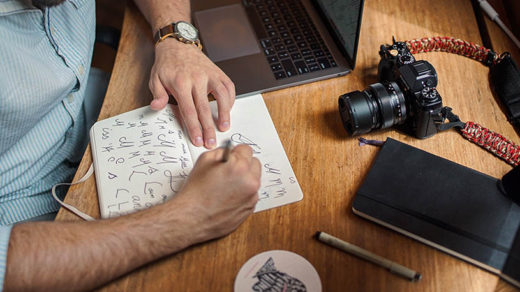
Logo design.
It can make or break a company, cost thousands of dollars (or perhaps upwards of a million dollars). It can drastically affect how the public views a business, government entity or nonprofit.
If done poorly, the after-effects can be devastating to a businesses’ reputation and bottom-line. If done well, a business could poise itself to reap rewards for years to come – rewards both in the financial realm and to its reputation.
What are the characteristics of a good logo?
There are always exceptions to any rule (or rule of thumb), and logo design definitely has its exceptional cases. However, there are a few universal characteristics that nearly all of the best logos have in common. Among them are:
- Versatility and scalability: more of a modern concern in the field of graphic design, todays logos need to scale down a tiny size for viewing on smartphones, while still looking great on large monitors, brochures, posters, etc.
- Simplicity: the more simple a logo is the more versatile, scalable and reproduceable it is. The use of negative space plays a key role in keeping a logo clean, simple and un-crowded even at smaller sizes.
- Memorability: a logo often has only a few seconds to convey the visual message of an entire company. Whether a logo is literal, abstract, or simply a logotype – the design, tone, fonts and colors need to be unambiguous and clear. Studies have shown that the most memorable logos are the most simple. Case in point: try to recall and draw from memory the Target logo; then try the same exercise again with the Tabasco (sauce) logo.
- Use of only a few colors: a truly versatile logo will look just as good in black & white as it does in color. It can also successfully be placed upon all different colored backgrounds and reproduced in that manner. The use of gradients is strongly discouraged for this reason. Keep it simple with color as well as design. Case in point: the Nike logo.
- Originality/ingenuity: this goes without saying, but good logos are of course unique as well as professional. Logo designers should avoid copying the style of other companies and their brands; this is advisable from both a legal and a creative standpoint. Great logos break the mold.
- They are timeless: giving in to current trends is not a good idea for a logo designer. Popular design styles come and go, but the best logo designs remain outside of the confines of any trends and stand the test of time.
- They are appropriate for the tone and brand of the company: an austere financial services corporation or law firm should generally stay away from using bright, primary colors, whereas those colors would set the perfect tone for a child-care center or children’s library.
The above principles of logo design can be distilled down to the essential 4 main principles. Those 4 logo design principles are explained further in the following video by Satori Graphics:
I would just like to add one more thing to the list above: some of the best logos just make a person stop and say “wow – that is so clever!” And it is along those lines that I present to you – in no particular order … (drum roll, please)
the BEST LOGOS EVER CREATED!
(well… in my opinion, that is)
Logos of smaller or not as well-known companies, zoos and nonprofits:
This first collection contains my favorite logos because I love the double meaning and the shrewdness of the visual pun that each image conveys. Some of these brands might not be known world-wide, but in my view these logos are world-class:
Logos of larger companies, corporations, musicals and sports associations:
The second collection below are also excellent logos and include some of the most famous and iconic brands in the world. I chose a few of them for personal reasons (ex: the old Hartford Whalers logo, not because it’s still in use, but because it’s close to home for me!):
Logo design is a fascinating industry with a long and rich history. To learn a little more about logo design and how it has evolved over the years, Design Hill has a beautifully crafted presentation on this very subject that’s worth a look.
This article Corporate Logo Redesigns: Better Before or After? takes a deeper dive into a few of the more famous corporate logo designs and how they have evolved through the years.
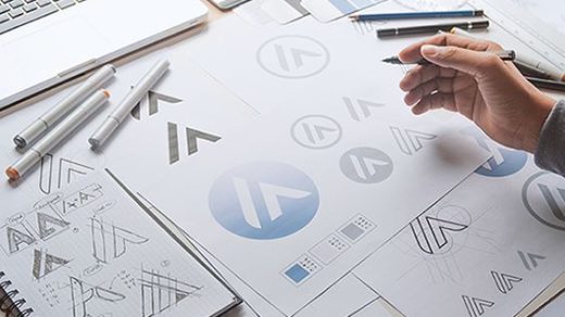
If you ever decide to delve into the world of logo design, remember that a truly unique, professional and timeless logo isn’t usually one that can be churned out in 1/2 hour. Oftentimes it’s actually a long, arduous and well thought-out process. For more info on that, check out this article to find out What Really Goes into Designing a Logo.
Thank you for reading – please share this article if you liked it! 🙂
