With the global marketplace breaking the world of graphic design services wide open with a plethora of choices (including cheap services obtained overseas), you may ask yourself, “Why should I pay hundreds (or thousands) of dollars for a logo when I can get one dirt cheap online?” There are many advantages to hiring a local graphic designer to design your logo and develop a brand for your company, but the most important take-away is that a well thought-out branding strategy will carry your company’s image and represent your company’s mission at a glance. It is too important to treat it as an after-thought or some small part of your company.
Your logo is the face of your company. It should reflect the vision of your business. It’s worth it to invest in a good logo that people will identify with for years to come. Why might a professionally designed logo cost so much? Below I outline a graphic designer’s logo design process, which will make it clear that you will get what you pay for.
If you’re thinking about taking on a project to design a logo for a client (or if you’ve already started), there are some key questions to ask your client along the way.
-
Know what the company does and how it serves its clientele.
This may seem obvious, but it is a necessary first step. The designer must think about the audience the company will serve — who the clients are. Is the clientele young, hip, and edgy? Or are they business men and women who work in high-end corporate America? The approach will differ based on the answer to this question.
It is very helpful to know the competition as well. Researching logos and branding of competitors and those of other similar companies in the industry or related fields will help the designer to know what’s already out there, in order to make their client look at least as good as (and hopefully better than) their competition.
-
Listen to the client’s ideas on what they would like their logo and branding to convey.
Talk about what message or image the logo should project. A company’s branding should reflect the personality of the company. Will the branding style be playful or serious? Understated or edgy? Corporate or outdoorsy?
Avoid wanting to include pictures of every aspect of your company in your logo. If you have ideas for imagery, feel free to communicate this. It can be helpful in the design process, but these images might be better used as supplemental illustrations that are used in marketing materials – and could be designed in conjunction with the logo so that they fit together as a brand. In most cases a logo should be a tight little package that communicates the company’s mission, not a complex illustration.
-
Brainstorm visual elements that communicate the company’s services.
What comes to mind visually when you think of the company’s industry, product, or service? Are there specific icons already associated with the product? For example:
- Arrows = movement
- Globe = international component
- People icons
- Fork/knife = food
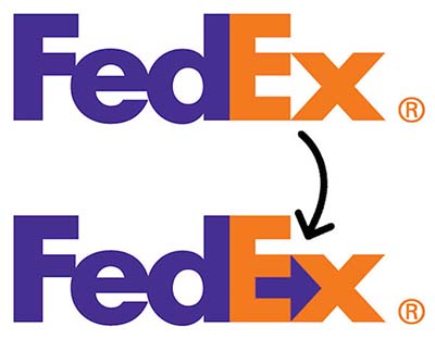
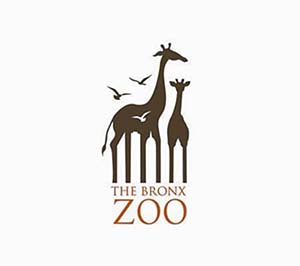
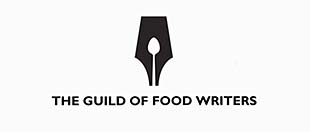
Beware of cliché icons that are overused (i.e. architectural columns representing education). Perhaps there is the opportunity to reinvent cliché icons or symbols, such as the ever-so-clever, almost hidden arrow in the FedEx logo. (Use of negative space is a great design tool when it presents itself!) Designers are always thinking outside the box. Check out these clever uses of negative space:
-
Study typographical options in the name.
Look at the company name as it is written, experiment with the name in various fonts, and pick a handful that convey the personality of the company.
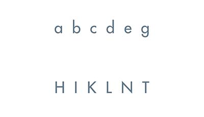
Think about the letterforms in the company name and which fonts accentuate these forms:
- Round forms: a, b, c, d, e, g, o, p, etc.
- Vertical forms: H, I, K, L, N, T, etc.
- Does the name look better in lowercase or uppercase?
Readability issues: Make sure the name is quickly and easily readable in whatever case you choose to set it (upper- or lower-case). The company name and logo should be recognizable at a quick glance. Is the company name very long? Does it contain several words? Try breaking them up visually with one large or main word and the other words smaller and stacked to the side or strung out underneath. This helps in readability.

Remember, a logo can be purely typographical or include some sort of graphic image element. Both options can be explored in the design phase, but perhaps a simple type treatment (without a graphic icon) is the best option. The key is finding just the right font and typographical treatment that communicates the essence of a company. There might be a subtle alteration of one or more of the letterforms to distinguish the logo, such as the tail of a capital “R” extending below the name.
-
Consider color options.
Go back to your conclusions of the personality of the company in step 1 when selecting colors. What type of color palette best reflects the nature of the company? A few broad examples of color palettes include muted, bright, neutral, beachy, pastel, or nature.
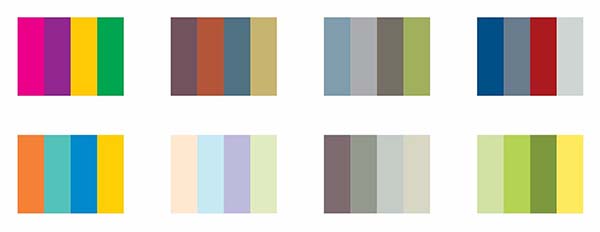
Keep in mind that your logo will also need to be recognizable in one color (see next section). Do not fall into the trap of relying on color differences to distinguish parts of the logo. This is where accessibility issues also come into play. If the logo is recognizable in just black, you will rest assured that a color-blind person will be able to appreciate your logo.
-
How is the logo going to be used?
This is an aspect of logo design that is often overlooked. In essence, it is necessary here to think for a moment “inside the box” (we must think outside the box when designing the logo, but then put our practicality caps on and think inside the box) in the sense that your logo needs to be practical and meet certain guidelines for size and use. It may be necessary to include both stacked and horizontal formats for various uses. Some instances to consider:
- Often website headers look best using horizontal formats.
- You might want a compact horizontal format to use in headers or footers in a PowerPoint presentation.
- How will your logo look printed on promotional materials such as pens, mugs, or stress balls?
- Will the logo look good at a small size, such as on a business card? Make sure all parts of your logo are legible scaled up and down.
- Perhaps you need an icon-only version (sometimes referred to as a “bug”) for PowerPoints or other subtle insertions of your branding.
- A blocky or stacked version might look best on a report cover, that takes up a more square-like space.
It is also necessary to create a one-color option with transparent background for use in black only for black and white publications, and white for use on a solid or dark colored background. A one-color version is also often used on t-shirts if your company sponsors community organizations or events.
A vector format of the logo is an absolute must for use on promotional materials (t-shirts, pens, mugs, and so forth) and signage. What does “vector” mean? This simply means the logo’s lines are created as editable shapes in a line-based drawing program such as Adobe Illustrator. Images are either vector- or pixel-based. Photos are pixel-based. Vector-based graphics can be scaled up and down without losing image quality, whereas a pixel-based image would lose quality when scaled up (photos scaled up will look fuzzy and pixelated).
Conclusion
As you can see, a lot of thought and consideration goes into designing a logo. It is worth spending the money on hiring a good, local, professional graphic designer who will take you through this process and produce a well-designed logo that will represent your business and brand to its fullest potential. A memorable logo and brand makes for a memorable company!
Check out this article for a designer’s take on some of the more abstract things to keep in mind, when designing a logo for a client.
And please check out this article for more info on the characteristics of a good logo and our take on which ones are the best logos ever!
 Anne McLaughlin has been a freelance graphic designer and owner of Blue Lake Design since 1999, working in both print and web design. She has had the privilege of working with a wide variety of clients on projects such as books (printed and e-books), brochures, logos, banners, signage, and websites. She has worked with small hometown businesses, large Fortune-500 corporations, as well as non-profit organizations and cultural institutions.
More about her work can be found at her website.


Thank you so much for the feedback and kind words!!
https://waterfallmagazine.com
I think that is one of the most significant info for me.
And i am glad reading your article. But should statement
on some general things, The website style is
wonderful, the articles is truly great : D. Excellent process,
cheers