My husband and I were working recently on a big project, creating a new website and logo for our hometown library. We decided it would be nice if, in the header section, we could hide the logo behind an image and have that logo slowly revealed after the page loads. After reading somewhere that animated logos are becoming all the rage, we were itching to give it a try.
Read on for the details on how we created an animated logo!
We started with a div to contain the logo image.
Here’s how you would code the div:
<div class="logo"> <img src="images/some-image.jpg" /> </div>
We styled this <div> to have the same height and width as the image contained within. We gave it a position of relative, and gave it an overflow property of hidden. This makes sure the logo does not show initially, when the page is first loaded into the browser:
.logo {

width: 250px;

height: 75px;

position: relative;

overflow: hidden;

}
We then needed to add the image our logo will hide behind.
We used the :before CSS pseudo element to achieve that result, like this: .logo:before
This allowed us to add content that will be seen in the same space as the content that is hidden. The content property contains the url of the image that will be seen initially upon page load. Here is how that piece of code is set up:
content: url(images/your-image.jpg);
Since the <div> has a position of relative, and we have given the before content a position of absolute, and we have set the before position property at top: 0 (meaning we are not moving it), the image our logo will hide behind is in the exact same position.
The overlaid image takes up the exact same space that the hidden logo occupies. The height and width are 100% so that the before content fills 100% of the hidden <div>. Also, we made sure the image is the same size as the hidden image and the <div>.
Here is the chunk of CSS code in its entirety:
.logo:before {

content: url(images/your-image.jpg);

position: absolute;

top: 0;

height: 100%;

width: 100%;

animation-name: reveal;

animation-duration: 3s;

animation-fill-mode: forwards;

animation-delay: 3s;

}
The animated reveal:
The reveal is delayed by a few seconds using the animation-delay property. That way the viewer will see the before image for a while after the page loads, and then slowly they will see the hidden image revealed. In this case the reveal takes 3 seconds using the animation-duration property.
The animation-fill-mode of forwards instructs the computer to keep what you see at the end of the animation, meaning you will only see your logo after the animation is completed. The keyframe tells the animation to move from the far left point to 100% from the left, thus revealing the hidden logo from left to right. To learn more about how to start working with keyframes in CSS, check out this article.
Here is the keyframes code:
@keyframes reveal {

from {left: 0%;}

to {left: 100%;}

}
Our initial research led to the following article on Stack Overflow: https://stackoverflow.com/questions/27644092/reveal-hidden-letters-from-the-left-by-sliding-to-the-right
We then modified and enhanced this code and added CSS animation effects.
Here is the animated logo in action:
(you might need to refresh your browser to see the animation run)
Logo design can be one of the most rewarding – and potentially frustrating – aspects of being a graphic designer. A whole lot of thought and planning goes into the logo design process, and you need to know the right questions to ask going into it. For further reading, please check out our article on some key questions to ask a client when going about designing a logo for their business.
To learn a few more ways to make things move using CSS, check out our article CSS Animations: Creating CSS Hover Effects.
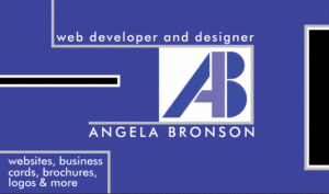
Having worked with Adobe Photoshop for at least 20 years now, I have found it to be an excellent tool for creating graphics and images of all kinds — including logos. I have created several logos over the years using Photoshop, including this one for myself when I first started my own freelance design business:
Photoshop is also a great tool for designing business cards. 🙂
Check out the fantastic deals that Adobe offers here. There are many different affordable plans available so you can get started editing photos, creating illustrations, or designing whatever your imagination can come up with!
Thank you for reading! Please share in the comments if you’ve ever created an animated logo for a client – and, do you think this is a trend that will actually catch on?