
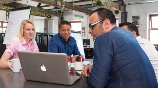
Well…. the headline of this article is a bit sarcastic and is also a huge exaggeration 🙂 This is just my way of gently poking fun at the trend of using superlatives in headlines – as seen in nearly every blog, YouTube channel or eCommerce website (“click here to learn more about the world’s best toaster!”)
But seriously, the websites listed down below are truly remarkable and have succeeded in pushing the boundaries of web design to a whole new level.
What constitutes a “creative website” (you may ask)? That’s a good question, and one that is very subjective and open to interpretation. In my opinion a truly creative website is one that gives the website user a taste of something new and unexpected – and delights them with little tidbits that they may have never encountered before within the digital world. BUT (and this is a big “but”) – actually good creative websites are the ones who keep the user’s experience in mind every step of the way.
The good ones don’t stray too far from the behavior that people expect to encounter when using a website. For example, there are some beautiful, sleek and modern, minimalistic sites out there that are graphically excellent but offer a horrible user experience. If people can’t find your navigation, how do you expect them to explore your site? And if your blog contains the most stunning photos and visual effects ever created but takes 40 seconds to load in the browser… then you’re missing the point and forgetting about the end user.
Ok! With all of that in mind, let’s explore some of the websites that are doing it right.
Honorable mentions for any most creative websites list:
A few of the latest cutting-edge trends in web design that many of the most creative websites and/or blogs have in common include:
- Changing the mouse cursor to something other than a hand when hovering over an active element on the page, and/or adding some type of tracking element that moves along with the mouse pointer:
There are various ways to achieve this effect, from installing a browser extension to coding it using jQuery or CSS. W3Schools has a nice listing of different mouse pointer styles that can be created using CSS.
Here are some real-life examples of websites that use different cursors and cursor trackers rather nicely:— portfolio website for digital designer Isabel Moranta
— Crazy About Eggs website for an innovative brand of fully organic eggs
— the Awwwards 2020 website
— super cool website for Canadian-based Jomor Design - Unusual transitions between screens, pages or elements of the website:
Gone are the days where websites are restricted to a simple clicking action to jump from one page to another, then clicking the browser “back” arrow to go backwards. With modern coding techniques and technology, so much more is possible nowadays. From parallax vertical scrolling and scrolling horizontally, to clicking and dragging, to fading out and in between parts of the website – the sky’s the limit on what might come next.
A few examples of clever transitions are:
— website for a “food event” company called Amuse Bouche, by Duall Studio, Victor Work
— company website for a design studio named -99®; site by -99 design studio, Alaa Alnuaimi - Use of horizontal scrolling:
This web user-interface trend is becoming so prominent, popular, and well-implemented that it deserves its own category. When implemented the right way, horizontal scrolling can enhance the viewer’s journey and entice them to keep exploring as your story unfolds. This is achieved by making them feel as if they’re flipping through the pages of a book or brochure. A word of caution though: this method of scrolling should be used sparingly and only with a specific purpose in mind, and if it makes sense within the context of your website and brand. If used incorrectly it could create a frustrating user experience and result in readers abandoning their journey through your website or blog.
These are just a few of the websites out there that use the horizontal scrolling method to great effect:
— the Palazzo Monti cultural center website (in addition to unusual way to move from one screen to another, this site includes certain elements that the user can click and drag). Website graphic design by PaperPaper, code by Matteo Sacchi.
— website for the Restore Hope Appeal by ZN Studio - Clever use of animation to create a real sense of interactivity and engage the user:
The most compelling examples of creativity in modern web design draw in the viewer, turning them into an active participant in the “experience” of using their website.
A few excellent examples of using animation as an interactive design element are:
— the Agence Goliath by Studio Goliath
— Lupii, a company website for a protein bar made from Lupini beans
— the North America User Conference website by Harshini Tanneeru
And here are some of the most creative websites that are at the TOP of our list:
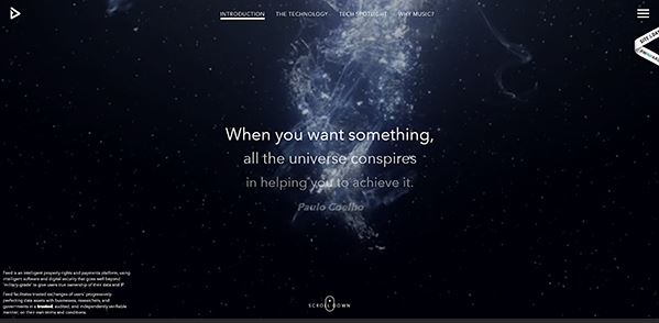
Feed
Website by Basilico
This website is absolutely mesmerizing and is definitely geared more towards a scrolling action, as opposed to clicking around and jumping from page to page. If you keep scrolling from the opening screen you might notice that it moves the top navigation bar from one main category to the next (the “Tech Spotlight” section is particulary awesome!)
Using video and animation, combined with stunning visuals, perusing through this award-winning site is sure to get your creative juices flowing:
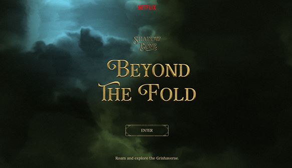
Beyond the Fold
Website by MediaMonks
This website is about the streaming Netflix fantasy series Shadow and Bone, and is extremely fun and engaging. With top-notch 3D effects, animations, games and trivia, I can see why it’s nominated for an award on awwwards.com. Not to mention the clever and very unusual way to navigate around the site… there’s just so much creativity there!
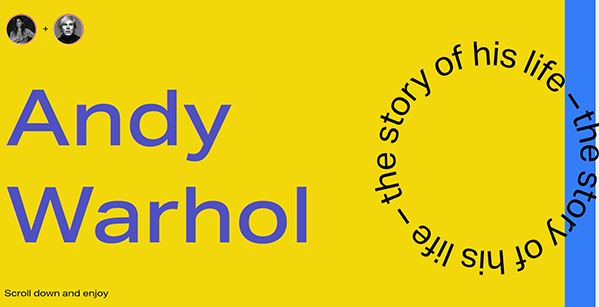
Andy Warhol
Website by miakravets
Talk about creativity – wow! – this website is literally a piece of digital artwork in and of itself. Using bright, bold colors and in-your-face typography as a design element, the site appears to perfectly capture the pop art style of the iconic artist himself. If you’re using a device with a mouse, try hovering over different elements and pieces of Andy’s artwork, and moving your mouse around. This is another website that is heavy on the scrolling action, as opposed to clicking around – and scrolling is the best way to open up and view all the creative goodies that are (at first) hidden from view:
Longshot
Website by Curate Labs, with illustrations by Mattis Dovier
The team at Longshot are movie-makers and their unique and entertaining website showcases their skills perfectly. Scroll to move around the site, and enjoy the animations and incredible interactivity that you’ll behold there! Nearly all of the animated elements are also clickable and lead to separate pages (which are almost as creative as the home page!)
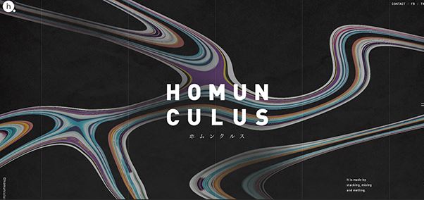
Homunculus
Website by homunculus inc.
First off, I just want to say that I LOVE the fluid animation used on this site – it makes it seem like everything is under water. Try scrolling down then hovering your mouse over the text there (or over the images) and you’ll see the that flowing, rippled effect again – and it’s very cool. The captivating watery effects coupled with the unusual navigation elements all result in a clever, innovative and enthralling user experience:
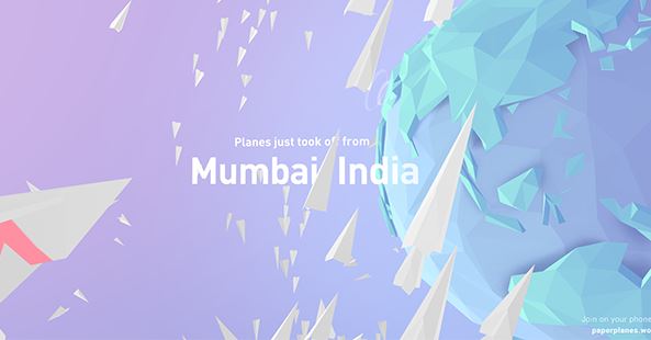
Paper Planes
Website by Active Theory
I’m usually working on and viewing websites on a wide-screen monitor, and would recommend all of the above be visited and experienced in that manner, if at all possible. However, the Paper Planes website is meant to be viewed on a mobile phone (Android preferably). The idea behind this project was to try to unite people from all around the world in a small way, as they “launch” paper airplanes, and then people from other parts of the world catch them.
The concept, the animations and the cooperative nature of Paper Planes makes it an enjoyable visit – and should qualify it for any best website list:
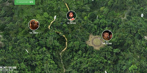
Rainforest Guardian
Website by Apt
This site offers up a visual feast and has stunning 3D effects, created using JavaScript WebGL coding technology. In order to experience the full visual effect of the Rainforest Guardian website, I feel it is optimal to be using a mouse and larger screen/monitor. You can zoom in closer by scrolling, click and drag different elements, enjoy panoramic views and learn about the native people and wildlife.
Not only is this a fun website to navigate around and explore, but at it’s core is an important cause worth learning more about:
The items mentioned in this article are just a sampling of the latest web technologies and advances in digital design. Web design is such a deep and broad field that there are many many more trends, tactics and techniques to watch for now and in the coming years. From lazy page loading to voice-activated interfaces to micro animation – this article by the design agency TheeDigital covers many of the latest trends in the fascinating and wonderful field of web design.
If you’re into building your own websites or you work with clients, this article from our blog covers some of the more traditional but very essential ingredients for any website or blog.
Which of the above websites do you find the most interesting, and which are your favorites? Please share this article if you liked it – and thank you for visiting our website!

