Pretty much any type of small business, corporation or nonprofit can benefit in so many ways from having a website. There are SO many creative options available to businesses and charities through the use of a website, including oodles and oodles of plugins for WordPress-based websites.
One of the projects I had the pleasure to work on last year was building a rather large and complex website for my local library. Library websites usually have many different ‘moving parts’ to them, and consequently often require several plugins to be installed and configured. In this instance, my client was asking for room-booking functionality, an events calendar, a tell-a-friend feature, among other things. One of the plugins that my client was asking for was an image carousel or slider, for display on their website homepage.
I have to admit, I spent way too much time researching the various sliders that are out there – then installing one, testing it out – finding out it wasn’t right, then uninstalling it. And the cycle went on and I was getting more and more frustrated.
One of the carousel or slider plugins that I tried out was the Soliloquy Slider. To be honest I was a bit disappointed with it. At first it looked like they had so many features available, but when I installed it and started using it – I could only do the most basic things with it. Everything else I clicked on kept asking me to upgrade to the Pro version. So I gave it a try and created a basic slider and hit Preview – nothing there. So I deleted the plugin and gave up (it might have been user error though).
One of the others that I tried out was the Slider by Nivo. Eventually I had to uninstall it because it made my slideshow massive and I couldn’t figure out how to resize it. (again, it might be user error, but I gave up trying to figure it out). Plus, the slideshow kept resizing to fit the height of the images that made up the individual slides. I was looking for a way to specify a certain height and width. With this slider plugin there didn’t appear to be many options available in the FREE version.
Then I happened upon the UR (Ultimate Responsive) Image Slider plugin by FARAZFRANK.
The UR Image Slider for WordPress
Frontend stuff (as seen via a browser)
This slider was beautifully responsive right off the bat! And I know this is a feature that lots of sliders have, but I get a kick out of how I can swipe it left or right on my phone to move to a different slide (as opposed to touching the screen to activate a back or forward arrow).
I also loved how many options I saw for customizing the small slider thumbnail images. They can be on or off; above the slide or below it; they can be whatever color or size you like; and you can decide upon a specified distance between thumbnail images.
Backend stuff
The interface on the backend is really easy to understand and use. It is quite intuitive, which is good for clients who are not too tech-savvy. Changing the order of the slides is effortless – just drag and drop!
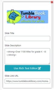
Example of how a slide appears inside the slider plugin interface
One aspect of this plugin that I didn’t like, however, is how I had to re-create the whole slide if I wanted to swap out the image on a particular slide. I’m still looking but so far there doesn’t seem to be a way to simply swap out a slide photo or illustration.
Also, the slide description (text overlay area) for each slide is hidden on smaller devices such as phones – which caught me by surprise. It didn’t seem to make sense to me, as to why it would need to be hidden. Or at least the user should have the option to display the description on mobile devices if they desire.
Lots of cool options for customization
Even on the free version of this plugin there are so many options for customization, such as:
- Slider Order – Ascending , Descending and Random:
Select from which sequence your first image slide will start. - Clone Slider:
You can make multiple copy of previously created slider so easily by hitting a clone slider button. - Label And Description Color Settings:
Give unique font color or background color according to your need. - Customize Slider Distance:
Decide what will be the appropriate distance between two image slides. - Slide Scale Mode:
Scale all images according to your size requirement.
The above details were taken as an excerpt from the WordPress.org plugin page for the UR Slider. For more details on the available options, you can check out that page here.
The customization/styling backend area looks like this (these are just a few of the numerous available options):
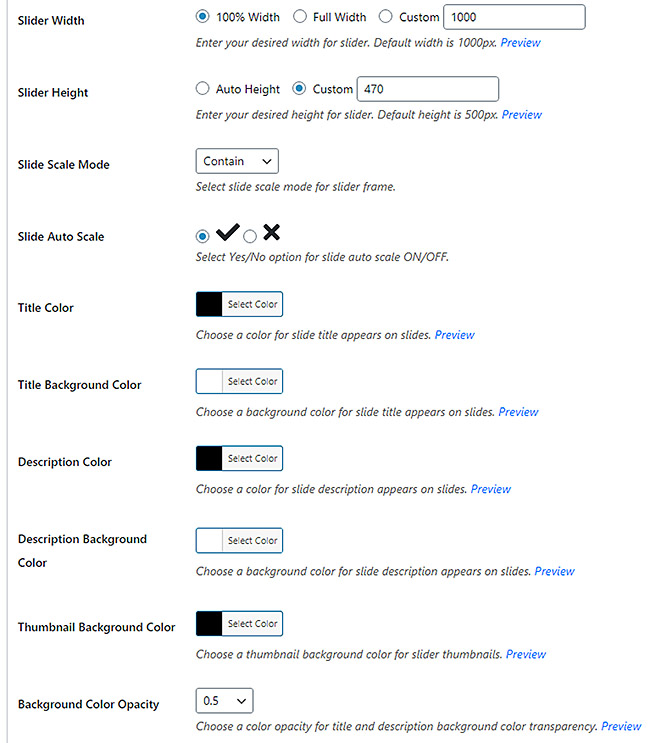
Below the big list of options is a large area where you can enter your own custom CSS (as if that would be necessary!)
I finally went for the Pro version
After tinkering around with the free version for about a week, I gave in and purchased the UR Image Slider Pro plugin (only $21). After I installed the zip file and activated it, I couldn’t figure out for the life of me how to get it to appear on the WordPress admin panel (along the left side of my Dashboard). I wasted time until I finally decided to deactivate the FREE version of this plugin, then I refreshed my browser and “UR Slider Pro” appeared along the left side. (woo hoo! Gotta celebrate small victories… )
With the Pro version you have the option to link the READ MORE (or LEARN MORE) text to another web page or document. This was actually a major factor in my decision to go Pro.
Only one major issue with this plugin
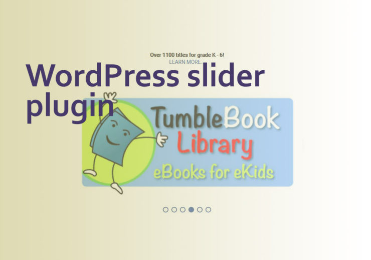
One of the few shortcomings this plugin has is the fact that the Slide Description text and its surrounding background area covers the slide, right smack dab in the middle of it. This was a bummer in the case of my client – being a library, or the Library Director to be more accurate. Libraries tend to be heavy on illustrations that contain a lot of text, and all of the images my client supplied me with for posting had words written across them (as in the TumbleBooks example above). So yeah – a description laying directly over the image would not work at all for these types of clients and their websites.

library illustration example
There is no way to move the description up above the slides (or down below), using the interface that comes with the plugin. Not wanting to ditch yet another slider plugin and start over, I came up with a fix for that using CSS.
I went into my browser and viewed the homepage of the library website (that displayed the slider), then right-clicked and chose “View page source”. Then I looked for any code that referenced “description” until I found the following (in red):

I figured that it was the HTML5 data-position="centerCenter" code that was forcing the description to lay across the middle of the slides. For more info on data attributes, Mozilla has a very informative article on the subject.
I tried to figure out some way to counteract that HTML using CSS, and played around with it for quite a while.
It might not be an ideal solution but this is what I came up with:
The overarching or parent div (that the slider sits inside of) contains a CSS class of “sp-slides” and looks like this in the code:
<div class="sp-slides"
So I searched through that code and isolated the paragraph element that contained the individual slides. I tweaked that in my CSS by referencing the “sp-slides p” class and ‘p’ element. Then I pushed the position of that paragraph way up from the bottom of the slider area using “bottom: 410px”.
Next I added 78px of padding to the top of the description for good measure, as follows:
/* for the homepage slider */

.sp-slides p {

bottom: 410px !important;

padding-top: 78px;

}

.sp-image {

top: 75px;

}
@-moz-document url-prefix() {
.sp-slides p {
bottom: 510px !important;
padding-top: 38px;
}
}
I had to experiment with the positioning of the slider images quite a bit (referenced by using the “sp-image” class), and finally landed on “top: 75px”.
This resulted in the slider descriptions (that paragraph section) being moved up above each slide, as seen here:

Next, in order to blend it in with the while background (of the Library homepage itself), I set the Description Background Color to white. Then I chose black for the Description (text) Color and made sure to turn all slide Titles off, because slide titles will also appear as an overlay across the middle of the slides.

Here is an example of how the description area would cover a lot of the slide image:
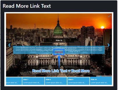
That screenshot also shows where the “READ MORE” text would appear within the context of the description area (in my case the text reads “LEARN MORE”).
In conclusion:
My long and arduous search for a truly versatile slider/slideshow plugin was happily ended when I found the UR Slider. I am not affiliated in any way with this plugin or its creator, but I would like to say “job well done” for offering so many options for customizing its look and behavior – even on the free version.
Please let me know in the comments which slider plugins you prefer, or if you’d rather code your slideshows manually (which I have done in the past and had a good experience with). I would love to hear your comments and/or questions. Thank you!
