Animating CSS is so much fun and there is SO much room for creativity working with this coding technique. Once you understand the basic structure of how animations are set up, you can use that foundation as a stepping-off point to experiment with different settings and properties.
As we did in the last article on the CSS Transform and Transition properties, first you need to single out a specific HTML element or CSS selector that you would like to animate. In this case we’ll use a DIV html element and will add a unique CSS id to it. If we add the animation code to the DIV element itself, that would apply the animation to every single DIV on the page (which is not a good idea). To single out one specific part of the page, it is a good practice to assign an ID to it (or a class if you would like the animation to apply in more than one instance).
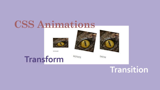
Getting started with CSS animations
Let’s use the following code on the web page:
<div id=”animateArea1”>AREA 1</div>
Then we’ll add this CSS to the Customizer if we’re working in WordPress, or otherwise will add the CSS to an external style sheet (that is linked to from our web page):
#animateArea1 {

    background-color: pink;

    height: 100px;

    width: 100px;

}
#animateArea1 {

    background-color: pink;

    height: 100px;

    width: 100px;

}
We duplicated this two more times, so now we have three squares going across the page – each with its own DIV area and its own unique ID:
CSS code for those 3 DIV areas:
#animateArea1 {

    background-color: pink;

    height: 100px;

    width: 100px;

	  margin: 15px;

	  padding: 10px;

}

#animateArea2 {

    background-color: lightblue;

    height: 100px;

    width: 100px;

    border-radius: 0%;

	  margin: 15px;

	  padding: 10px;

}

#animateArea3 {

    background-color: tan;

    height: 100px;

    width: 100px;

	  margin: 15px;

	  padding: 10px;

}

}
Ok now we’re ready to start experimenting.
Working with Keyframes
The basic building-blocks of CSS animations are called keyframes. So we’ll add some of those to our “#animateArea1” ID within the CSS code, like this:
@keyframes scaleUp {

  0% {

    transform: scale(1);

    opacity: 0;

  }

  25% {

    transform: scale(1.3);

    opacity: 0.2;

  }

  50% {

    transform: scale(1.5);

    opacity: 0.4;

  }

  75% {

    transform: scale(1.7);

    opacity: 0.7;

  }

  100% {

    transform: scale(1.4);

    opacity: 1;

  }

}
- First bring in the keyframes by sticking a “@” symbol in front of the word “keyframes”.
- Then add the name of the animation code you added (or are about to add) to the CSS file. In this case I named my new animation “scaleUp”.
- Next you’ll need to decide on the intervals or stages that the animation should go through from start to finish. I like things nice and neat, so I broke down the intervals into 25% each. Intervals for keyframes start at 0% and end at 100%.
- Next you will decide exactly what you’d like to happen at each of the interval points during this animation sequence. I chose to use the “transform” property so we can build upon the previous lesson on CSS transform and transition.
- You can throw as many effects in there as you’d like (within reason). I added “opacity” so the animation will slowly fade in.
After you have defined the details of how the animation should act, you need to assign it – or link it – to something within your web page itself. Let’s go back to our original HTML where we created a DIV and assigned a CSS id to it. Take note of the id name, and add the following two lines to that id inside your CSS or style sheet:
animation-duration: 7s;

  animation-name: scaleUp;
The code for the #animateArea1 selector in its entirety would now look like this:
#animateArea1 {

    background-color: pink;

    height: 100px;

    width: 100px;

    margin: 15px;

    padding: 10px;

    animation-duration: 7s;

    animation-name: scaleUp;

}
The “animation-name:” would be whatever you have named the animation you created (using the @keyframes code above).
The “animation-duration:” could be either in milliseconds or (my preference) in seconds. Our animation here will run for 7 seconds (or 7000 ms).
OR to be shorter, more efficient and concise about it we can write both of those lines together on one line like this:
animation: scaleUp 7s;
Here is the animation in action:
I decided to take it one step further and animate the second DIV area as follows:
#animateArea2 {

    background-color: lightblue;

    height: 100px;

    width: 100px;

    margin: 15px;

    padding: 10px;

    animation-duration: 8s;

    animation-name: shapeMorph;

}
@keyframes shapeMorph {

  0% {

    transform: scale(.5) rotate(2deg);

    opacity: 0;

border-radius: 0%;

  }

  25% {

    transform: scale(.8) rotate(15deg);

    opacity: 0.3;

border-radius: 7%;

  }

  50% {

    transform: scale(1) rotate(25deg);

    opacity: 0.5;

border-radius: 20%;

  }

  75% {

    transform: scale(1.2) rotate(40deg);

    opacity: 0.7;

border-radius: 35%;

  }

  100% {

    transform: scale(1.5) rotate(70deg);

    opacity: 1;

border-radius: 50%;

  }

}
Here is the second animation in action:
- First bring in the keyframes by sticking a “@” symbol in front of the word “keyframes”.
- Then add the name of the animation code you added (or are about to add) to the CSS file. In this case I named my new animation “shapeMorph”.
- Next you’ll need to decide on the intervals or stages that the animation should go through from start to finish. I kept the intervals into 25% each. As in the previous animation, the intervals for keyframes start at 0% and end at 100%.
- Next you will decide exactly what you’d like to happen at each of the interval points during this animation sequence. I chose to again use the “transform” property but instead of only using the “scale” method I added another one called “rotate”.
- At each interval in the keyframes sequence we now have 2 transform methods, like this:
transform: scale(.5) rotate(2deg);.
You can use multiple transform (or other) properties at once, as long as you state them on one line of code. - By adding “border-radius: 50%;” to the animation – at each interval – we’re telling it to increase the curvature of the border, at the 4 corners of the square. A 50% border-radius will result in a circle.
- The animation above grows larger, increases in opacity (gets darker), rotates, AND morphs from a square into a circle, all in the course of one animation sequence.
Animation Iteration Count and Timing Function
Because we would like the animation above to play over and over, we added the following line to the CSS code (to the chunk of code containing the #animateArea2 CSS selector):
animation-iteration-count: infinite;
The default value is for the animation to play only once, then stop. Or the # of iterations can be specified using a numeric value, such as:
animation-iteration-count: 1;
The numeric value you use doesn’t have to be a whole number; you could specify a value such a 2.5. Other ways of specifying how many times an animation will play are inherit and initial.
We also added the following line to the same CSS selector, to tell the animation to run at a smooth, even rate of speed:
animation-timing-function: linear;
Other values to use with animation-timing-function include “ease” and “ease-in-out“. For a detailed explanation of all the different animation-timing-function values, Mozilla has an excellent article you might want to check out.
This might be a good time for me to mention that I have not been using any “vendor prefixes” in my CSS code for this particular article. If you’re writing CSS that is experimental and hasn’t been fully tested and vetted in multiple browsers, then by all means go ahead and add vendor prefixes to your code. Otherwise if your code is pretty standard, it might not be necessary to use them. For example, I used “border-radius” in the animations above, which is now fully accepted by most major browsers. Consequently, I used the standard code without adding any vendor prefixes to it.
Ex: instead of my code looking like this:
-moz-border-radius: 50%;
-webkit-border-radius: 50%;
border-radius: 50%;
It looks like this: border-radius: 50%;
Below are the most-often used prefixes, and their corresponding web browsers:
Chrome: -webkit-
Android: -webkit-
Firefox: -moz-
Internet Explorer (IE): -ms-
Safari: -webkit-
iOS: -webkit-
Opera: -o-
Test, test, test – just to be on the safe side.
For more info on this subject, Lifewire wrote a good article about CSS Vendor Prefixes.
There is SO much more that can be done using CSS animation techniques, so this is just the tip of the iceberg. Let us know in the comments if you have any questions and/or what else you would like to learn about this subject. And by all means, go out and code and have fun with it! : )