
Back when I was finishing up college in the late ‘90s it was an exciting time to be a web developer (and it’s still exciting of course – it’s just a lot different nowadays). I had landed a wonderful job as a front-end web developer in a major corporation, after being placed there through a college work-study program. Everything about the internet was so new to me – it was new to most everyone, really – and I couldn’t wait to see how this new “world wide web” thing would develop in the years to come.
I remember the rush I felt when I realized that all forms of knowledge, training, information – everything I ever needed or wanted to learn was developing right there before me, online.
Oh, the possibilities … !!
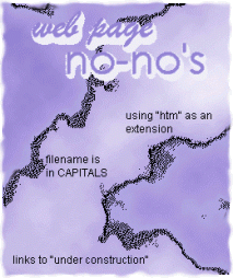
So I taught myself html and a little css as quickly as I could and launched into my work with eager anticipation. My first primary role was to be (mostly) in charge of creating an internal website for my department, something called an intranet website. I had so much fun creating my very first website, and did I ever experiment with the graphics and clipart (lots of clipart was used in those days)! Part of that intranet site was a section for “Best Practices For Creating Web Pages” where I listed out web and html best-practices. I was so proud of the graphics I created … such as:
In the early days of the web it was basically like the wild west, with few rules in place to keep things under control. Usability studies weren’t even all that established yet as something people should care about, so front-end developers (or non-developer business folks who put themselves in that position with little awareness of what they were doing) pretty much went hog-wild.
My manager and I were tasked with reigning in the creative urges of these folks in all of our neighboring departments. Every department was developing its own intranet site and we were the gateway through which they had to pass, in order to get their web pages published. Let me tell you – we were not always popular and people got annoyed with us for enforcing some type of order (and common sense) in their websites (I remember my manager and I being referred to as the “Web Police”).
Animated clipart
One of features we saw over and over on those intranet sites (and across all of cyberspace, actually) was the overuse of little “New!” clipart images. They were all over the place, which kinda diluted their effectiveness:

Look, here is something new we added to our homepage!
Look, here is something else we added to our homepage!
And look at this!
Are you looking yet, or are you eyeballs bleeding from all these bright, distracting colors??
Another old and thankfully not-used-anymore technique for grabbing the user’s attention was the scrolling marquee. This was done by using the <marquee> html tag, which is non-standard now and should not be used in modern web design. I do have to confess I used this myself once or twice, back in the day. Just try to read or pay attention to anything else while this is moving incessantly across your field of vision:
Hi, I’m a scrolling marquee!!
Clipart was king in those early days of the world wide web and was sorely misused and overused. Free clipart websites and directories were in plentiful supply. I have a vivid memory of rejecting a web page that was submitted for review from another department that literally had dancing elephants all over it! But hey, at least it grabbed my attention…

Yet another completely overused tactic from the dawn of the internet is blinking text and/or blinking images. I can proudly say that I never employed this tactic to grab a viewer’s attention. Wow, this is so annoying!!
Look at me! Look at me!
Website layout and structure
The overall structure and general layout of websites used to be much narrower (than today’s commonly used full-screen or full-width layouts). Websites were often set up in a rectangular 3-column grid layout. Websites used to also pack a LOT of information into not a lot of space. It used to be fairly common to have a main navigation bar at the top, then an additional (secondary) navigation bar along the left or right columns. So right off the bat the user was hit with about a zillion different navigational or menu items and options…
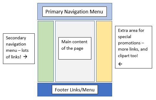
Plus the other column (the one that didn’t house a menu bar) often contained lots of callout or promotional boxes – special offers and other attention-grabbing tactics. The center column was for the main content, which of course was usually crammed full of details too.
Making the user scroll a lot to view content was discouraged and was viewed as a poor user experience. The goal was basically to cram as much information as possible into the upper part of the viewer’s screen; to have as much content as possible be visible “above the fold”. In stark contrast this, most websites today make scrolling very necessary (or even encouraged). Often you will see an entire website contained within one page, with links/bookmarks or breadcrumbs near the top that link down to all of the different sections. I actually like this approach better than the old way of doing things.
This is a broad generalization of course, but the old way was to have tons of links to sections/pages up in the main menu, linking out to many secondary – usually quite short – pages. This forced the user to click A LOT, then they’d have to wait for each page to load, then click a lot more, etc. Pretty frustrating …
I remember when top and/or side menus started morphing from static rectangles and links to the more modern and dynamic “flyout menu” style. This was a vast improvement, but still there was a tendency to try and cram a link to practically every page of a website in that one menu. I’m talkin’ maybe 20 links or so that would fly out below each of the main menu categories! Since then, web designers have learned that it’s better to keep main menus pared down to the most important pages and sections of their websites.
Image maps
Back in the day, image maps were all the rage. This was before CSS began to truly expand the horizons of website layout, so what developers (ahem, myself included) did was create a big, complex image in Photoshop, Corel Draw (or whatever), then then map out coordinates of all the different pieces of that image. Those different coordinates would all link to a different web page or site.
Well, today we know better and realize that image maps are quite bad in terms of accessibility, SEO, page-load time and usability. It isn’t a good idea to embed text directly into an image anyway – it makes it so much more of a hassle to change the text in the future, than if your text was handled via HTML or CSS.
Then there’s also the fact that most image maps aren’t really responsive. So this is a reminder – don’t use them if you can avoid it.
Example of an old image-map I created back in the old days
Frames and iFrames
Last, but certainly not least – are frames. Thankfully what used to be the commonplace use of frames is no more. Back when I started coding websites, Frontpage was one of the only options out there. So enter the <frame> and <frameset> tags. The “frame” and “frameset” html elements are no longer part of HTML at all – and for good reason: they take over your page, confuse the user, cause SEO problems, create printing problems and bookmarking issues, and so on.
Note: Frames and iFrames are not the same thing. iFrames (inline frames) are still commonly used, because they do not take over your whole screen, and they allow the developer to embed content of another website inside of the parent document (or parent website). Mozilla has a great training article all about the iframe html element if you’d like to learn more on this subject.
Let’s go back in time…
Take a trip down memory lane with me (if you are old enough – haha), and check out the Wayback Machine (this will take you to https://archive.org/web/). The Wayback Machine is an online digital library, and is administered by the Internet Archive, a 501(c)(3) nonprofit organization. Type in any web address into the search bar at the top and it will show you a timeline of the different snapshots that have been taken of that website through the years.
Website design was only in its infancy in the 1990’s. It wasn’t always pretty (much of it was pretty ugly, actually), but through trial-and-error those early web designers and developers paved the way for the modern world of web design that we experience today.
To learn about some of the key items to include on any modern website, please check out this article.
Please share this article if you liked it, and come visit the blog again 🙂


