As I mentioned in another post about creating a CSS box/grid-based photo guessing game, one of the things I love about my profession is the seemingly endless possibilities of what can be done using code, and how it gives me the opportunity to be creative. Lately I’ve been especially geeking out over CSS animations. Using CSS to animate elements of a web page is so much fun and is easier than wrestling with JavaScript, jQuery or other animation coding techniques. Before diving into the details on CSS animations, it would be good if you already have a solid grasp of HTML and CSS. If you don’t already have that training under your belt, a wonderful resource for learning is W3Schools, and they have extensive tutorials on HTML, CSS and more.
ok – now, on to animate some CSS!
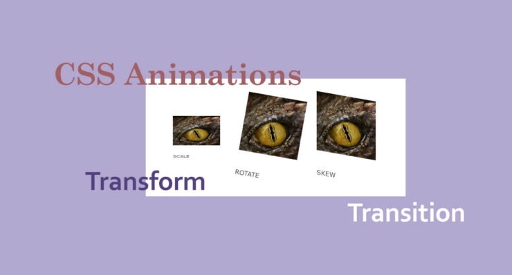
First off you will need to have an HTML element or image (or something) in mind that you’d like to animate. I chose the dragon eye image from our main business website, because…
a) it fits nicely into the Code Dragon branding and
b) I am totally fascinated by dragons. Part of me wishes they were real and another part of me is incredibly glad they are NOT (the logical part of me that knows if I ever encountered a real dragon, I’d end up as fried chicken).
But I digress …
Alright, let’s create a simple area to work in, using the HTML DIV element. The DIV element is a block-style element that takes up more than one visual line of space. For more info on block HTML elements, check out this article on that subject.
Now it’s time bring our dragon eye image into the HTML and target that in the CSS.
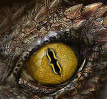
This is what our baseline HTML code looks like:
<div>

<img src="https://codedragontech.com/createwithcodedragon/wp-content/uploads/2019/12/dragon-eye.jpg" alt="dragon eye" width="220" height="203" class="aligncenter size-full wp-image-768" />

</div>
Next we’ll start applying different CSS animation code to our baseline code, to try out different effects. Add an ID to the DIV section that we started with so we can do something unique to it that won’t affect any of our other elements or code. Then duplicate that section and change the ID just a little for each separate effect.
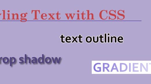
CSS Transform Property
The transform property comes in handy when you want to manipulate an HTML element. For example: you can rotate an image, skew it, move it along the X or Y axes, or scale its size to be smaller or larger.
For the CSS Transform examples below I added id="imageScale" to the first image/section, id="imageRotate" to the second, and id="imageSkew" to the third.
A sample of what the code would look like for one of the sections is as follows:
<div id="imageScale">

<img src="https://codedragontech.com/createwithcodedragon/wp-content/uploads/2019/12/dragon-eye.jpg" alt="dragon eye" width="220" height="203" class="aligncenter size-full wp-image-768" />

</div>
SCALE
ROTATE
SKEW
Scale
Image #1 above has been shrunken down using the scale method. This is what the CSS looks like:
#imageScale {

	transform: scale(.8,.5);

}
The first value will determine the width of your element, and will scale it up or down along the horizontal X axis. The second value will determine the height of your element, and will scale it up or down along the vertical Y axis.
A longer way of saying the same thing is like this:
#imageScale {

	transform: scaleX(.8);

        transform: scaleY(.5);

}
Rotate
Image #2 above has been moved clockwise using the rotate method. This is what the code looks like:
#imageRotate {

	transform: rotate(10deg);

}
Your element will rotate clockwise by the number of degrees you specify, and using a negative number will rotate the element counter-clockwise.
Skew
Image #3 above has been distorted using the skew method. This is what the code looks like:
#imageSkew {

	transform: skew(10deg, 10deg);

}
The first value will skew/distort an element along the horizontal X axis. The second value will skew/distort it along the vertical Y axis.
A longer way of saying the same thing is like this:
#imageSkew {

	transform: skewX(10deg);

        transform: skewY(10deg);

}
CSS Transition Property
The transition property is a good choice when you want to create a simple animation that has a clear beginning and end. Transitions are usually smooth and fluid, as the browser does a nice job of filling in the points between the start point and the end point. They are often used when creating mouseover or mouse-hover effects or when a button is clicked.
(A while back I was playing around with some CSS hover effects and created this animated ‘modern art piece’ here).
For the CSS Transition examples below I added id="imageEffect1" to the first image/section, id="imageEffect2" to the second, and id="imageEffect3" to the third.
A sample of what the code would look like for one of the sections is as follows:
<div id="imageEffect1">

<img src="https://codedragontech.com/createwithcodedragon/wp-content/uploads/2019/12/dragon-eye.jpg" alt="dragon eye" width="220" height="203" class="aligncenter size-full wp-image-768" />

</div>
BORDER
OPACITY
HEIGHT
Image Effect #1
Image #1 above has the transition applied to its border property. In all three of the following examples I had to bring in the IMG element and start targeting that with the CSS (it was acting a little wonky when I tried to create these effects on the DIV areas by themselves). This is what the CSS looks like:
#imageEffect1 img {

	border: 1px solid blue;

	padding: 4px;

	margin: 0px 20px 0px 15px;

	transition-property: border;

        transition-duration: 6s;

        transition-delay: 1s;

     }
Then to trigger the transition effect I added a HOVER pseudo-class to the existing “#imageEffect1” ID and pasted it into its own CSS snippet. This hover code area is where we want to specify what should happen when the image is moused-over – where we’d like the animation to end up:
#imageEffect1:hover img {

	border: 10px dotted black;

}
transition-property area is where you specify exactly what you would like to place the transition effect on. It could be the height or width of an image, the font size of some text, background-color or many other things. Mozilla has a very informative article listing out which properties can have the transition effect applied to them.
The transition-duration area is where you would specify how long it should take for the animation or transition to occur.
The transition-delay area is where you would specify when the transition should start (ex: after a 5 second delay).
Image Effect #2
Image #2 above has the transition applied to its opacity property. This is what the code looks like:
#imageEffect2 img {

	opacity: 1;

	padding: 4px;

	margin: 0px 20px 0px 15px;

	transition-property: opacity;

        transition-duration: 6s;

        transition-delay: 1s;

    }
Then to trigger the transition effect I added a HOVER pseudo-class to the existing “#imageEffect2” ID and pasted it into its own CSS snippet:
#imageEffect2:hover img {

	opacity: 0;

}
By bringing the opacity down to 0 we’re telling the browser not to display the image on mouse-hover. This results in a nice, smooth fading-out effect, instead of a more sudden, on & off effect that would occur without the use of the transition code.
Image Effect #3
Image #3 above has the transition applied to its height property. This is what the code looks like:
#imageEffect3 img {

	 height: 150px;

	 padding: 4px;

	 margin: 0px 20px 0px 15px;

	 transition-property: height;

         transition-duration: 6s;

         transition-delay: 1s;

      }
Then to trigger the transition effect I added a HOVER pseudo-class to the existing “#imageEffect3” ID and pasted it into its own CSS snippet:
#imageEffect3:hover img {

	height: 10px;

}
This is pretty self-explanatory in terms of how the image shrinks down from 150px to 10px.
For CSS animations, transform and transition effects are just the beginning but should provide any developer or web designer with a solid foundation on the subject. Please check out Part 2 of this CSS animations series:
How to Create CSS Animations: Keyframes
to move on and learn about this subject in more detail.
I hope you liked this article and that it sparked a little bit of your creativity to go and create something with code! Please share and let us know in the comments what CSS animation effects you like best.